Every now and then I have a really good experience on a website which makes me think ‘I really should share that!’. Today that was on www.lostmy.name.
Aside from being a website which offers a great product for children (personalised books which tell the story of the character losing their name and then going on an adventure to find it letter by letter), it is a really good website. Easy to use, and it has real character.
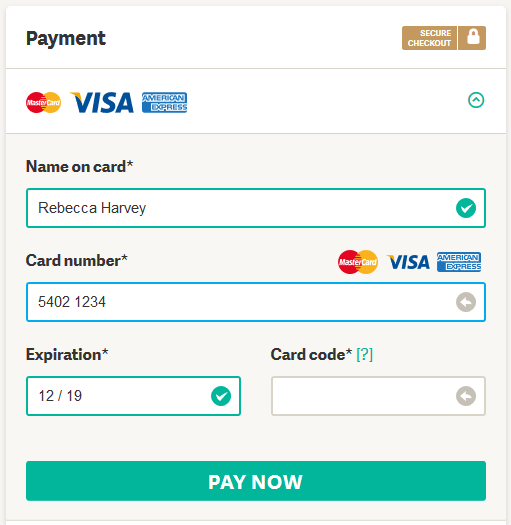
What really made me stop to appreciate the experience though was the form filling on the order and payment pages.
I was initially a bit confused by some fields being green and others being grey, but then I realised that the green fields are the ones which are already completed, or don’t need to be completed to continue (e.g. Address Line 2).

What really wowed me, and it’s a pretty small thing, was that as I was entering my credit card number the big gap between every 4th number was automatically added. This is a small thing. But it really helps when you are double checking what you’ve entered on the screen against your physical card, because that’s how most credit cards set their numbers out on their physical cards.
Another neat feature was when you click on ‘Next’, a no-entry type icon appears on top of the button probably to indicate that you have indeed pressed it and that you don’t need to press it again. Maybe a nod to those impatient types who aren’t sure if they’ve pressed a button or not if the page takes slightly longer than normal to load. It must be said that I didn’t notice any of the pages taking a while to load on this site.
Such simple little things. But it goes to show that it’s the details which can make or break the experience.